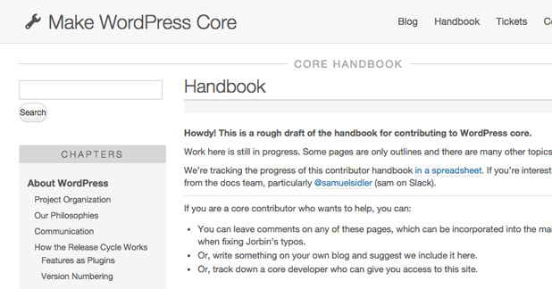
WordPress has this handy theme review handbook. On my quest to learning about accessibility, the requirements in this handbook seemed the next logical step. Since accessible links have been an overwhelming topic for me, learning requirements first give me a head start in addition to learning about making links accessible via context.
The handbook has three required rules for accessible links:
- Keyboard Navigation: Visible focus states
- Link Text: Screen reader text
- Skip Links
We’ll go over all three in this post. This post is on the lengthy side, but it’s all pretty easy to pick up. What’s difficult is making these techniques a habit in your everyday coding. That, I think, is what takes practice. This post also assumes you’re familiar with basic Css and comfortable with minor edits in theme template files.
Time to dive into our WordPress themes!
First, Focus Styles.
The easiest change to make out of the three, but definitely takes making a habit of, are focus styles. In the handbook, it’s referred to as “keyboard navigation”. This is done via Css. The focus state happens when a user is interacting with an element. I don’t want to use the word “active” as that is it’s own state. A link is considered “active” the instance a mouse clicks on it before it’s released again. Whereas focus isn’t necessarily about being clicked on, but being the current element you’re interacting with. Now I didn’t pull this definition from anywhere, I’m just spouting what makes sense to me and hoping that describing it this way makes it easier for others to understand.
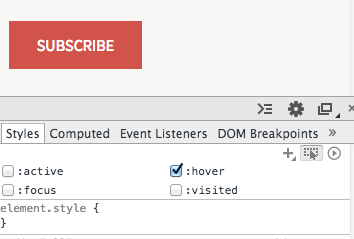
Chris Coyier does a great job breaking down what :focus is. It’s main advantage with accessible sites is the ability to visually see what element you’re on whenever you’re tabbing via keyboard or similar device ( see my screenshot above for an example ). In other words, this is something we absolutely need for sites because unlike mouse-users, keyboards can’t access hover states. This is why we need to make sure focus styles are written in our stylesheets and hovers alone are not enough.
Anyway, knowing to do this is one thing. The problem I’ve seen and have done myself ( I’m just as guilty ) is using resets stylesheets that remove all focus styles site-wide. Then forgetting to replace them during any development that follows. So they remain “turned off”. The solution is to ensure that whenever writing hover styles for your site, you include focus with it.
Maybe a client or designer asked that you remove that ugly dotted outline. Removing the dotted outline isn’t a problem, but it should be replaced with something.
So this is the habit I’ve been doing and we should all be doing assuming that your focus style is the same as your hover style:
/* Css Version */

a:hover, a:active, a:focus { text-decoration: underline; }

/* Sass Version */

a {
      text-decoration: none;

      &:hover, &:active, &:focus {
        text-decoration: underline;
      }
    }
And that’s it! When hovered over or tabbed to, the links will appear underlined if using the example above. This is also assuming the dotted outlines have been removed either manually or by a reset stylesheet.
Keep in mind that my example only covers focus styles for links. Form elements and buttons should have focus styles as well! Buttons can have active, hover, and focus styles whereas with form elements like text areas and text inputs, a focus style is enough. Check out WebAim’s “Creating Accessible Forms” for more info.
You can test your focus styles using your tab and shift/tab keys. You can also use your browser inspector to see what your focus states look like:

Next, a class you’ll use everywhere!
I’ve been using this in my more recent WordPress projects as well as non-WordPress. It’s just a class in Css that you can apply anywhere. It’s such a powerful technique and yet, really simple. What am I talking about? The screen reader text class, or in WordPress theme stylesheets, it’s usually named screen-reader-text. The handbook refers to it as “Link Text”.
If you want to see an example right now, this is commonly used in skip links ( going to talk about that last ) and read more links.
If you peek into the Twenty Fifteen theme, in content.php, you’ll see these lines of PHP:
 <?php
 /* translators: %s: Name of current post */
 the_content( sprintf(
 __( 'Continue reading %s', 'twentyfifteen' ),
 the_title( '<span class="screen-reader-text">', '</span>', false )
 ) );

 wp_link_pages( array(
 'before' => '<div class="page-links"><span class="page-links-title">' . __( 'Pages:', 'twentyfifteen' ) . '</span>',
 'after' => '</div>',
 'link_before' => '<span>',
 'link_after' => '</span>',
 'pagelink' => '<span class="screen-reader-text">' . __( 'Page', 'twentyfifteen' ) . ' </span>%',
 'separator' => '<span class="screen-reader-text">, </span>',
 ) );
 ?>
This looks like a lot, but in it’s simplest form, an example from the handbook, a read more link will look like this:
<?php
the_content(
	sprintf(
		__( 'Continue reading%s', 'textdomain' ),
		'<span class="screen-reader-text">  '.get_the_title().'</span>'
	)
);
?>
This above is the more accessible version of using the_content function in any archive type template file – e.g. page.php, content.php, loop.php for older themes – any template that’s meant for a list of posts versus just the single permalink version of a post.
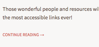
What’s happening is for those who can physically see the site, that link will read as “Continue reading”. For screen-readers, however, the screen-reader-text class is pushing the title of the post off screen for visual readers, but it’s still readable. So for screen-readers, it will be read as “Continue reading The Required Rules of Accessible Links,” if we use this post as an example. This is necessary if you read my previous post on accessible links, because there are screen-readers that pull all the links out of context. And therefore, alone, those links don’t make sense anymore if they’re just a list of “Continue Reading” over and over.
So this trick ensures that screen-readers have all the information without interfering with the visuals of a site. This class is also used for links that are icons only. Chris Coyier has a great technique he uses to ensure these icons are accessible: HTML for Icon Font Usage.
In the case of the Twenty Fifteen example, the theme is also using the screen-reader-text class on the links that paginate between WordPress posts in single view. Visually this reads as “Previous, Title of post.” On screen-readers, it will be read as, “Previous post: Title of post.”

Okay, okay, it’s used everywhere. We get it! Now here’s what you’re putting into your stylesheet straight from Joe Dolson’s post, Hiding text for screen readers with WordPress Core:
.screen-reader-text {
	clip: rect(1px, 1px, 1px, 1px);
	position: absolute !important;
	height: 1px;
	width: 1px;
	overflow: hidden;
}
The above is the preferred method in WordPress, but there’s also this alternative which is what I normally like to use for non-WordPress sites:
.screen-reader-text {
    position: absolute !important;
    left: -999em;
}
So the combination of absolute positioning and the clip or left value is what pushes text you don’t want visible off the screen, but still leaves it accessible for screen-readers. Since we talked about focus already, you can put a focus style on the screen-reader-text class as well. Joe Dolson provides the Css for that, but it’s normally used for skip links rather than a site-wide thing.
Speaking of skip links…
Finally, Skip Links!
Before we go on with this, I want to point out Carrie Dills’ post, How to Add Skip Nav to Your WordPress Theme. She explains what skip links are as well as how to implement in less than 5 minutes without code!
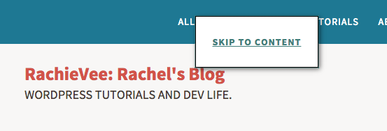
Skip links work with focus styles, in other words, they’re supposed to be accessible by keyboard or similar device. They allow you to skip through parts of a site quicker versus having to manually tab through every element on a page. It looks like this on my blog’s theme, a child of the Hexa theme:
Skip links are normally in these places: ( at least from what I’ve observed – if anyone finds documentation for this, let me know? )
- Before the WordPress admin toolbar asking if you want to skip to the toolbar.
- Before the site’s main nav asking if you want to skip to the content.
- Carrie Dils’ blog also has one before her main nav asking if the user wants to go to the sidebar. I think that’s cool because normally you’d have to tab through all of that content on the left side before getting to the sidebar, so that shortcut is handy!
Code-wise, this is how you would implement a skip link, and guess what? It makes use of that awesome class we talked about earlier, screen-reader-text! Gotta love that thing.
<a class="skip-link screen-reader-text" href="#content"><?php _e( 'Skip to content', 'twentyfifteen' ); ?></a>

If you already have the class in place, all you need to do is put the ID of your main content wrapper, and that’s all! The work has already been done for you. Oh, and in this case, you’d need focus styles for skip links. In Twenty Fifteen, it looks like this in style.css:
.site .skip-link:focus {
	clip: auto;
	height: auto;
	left: 6px;
	top: 7px;
	width: auto;
	z-index: 100000;
}
This is what takes the link that’s normally pushed off screen with the screen-reader-text class, and makes it visible again when tabbed to.
Here is Joe Dolson’s version:
.screen-reader-text:focus {
    clip: auto !important;
    display: block;
    height: auto;
    left: 5px;
    top: 5px;
    width: auto;
    z-index: 100000; /* Above WP toolbar. */
}
And that’s it! For most standard WordPress themes like the Twenty Somethings, a lot of this will already be implemented. This post for accessible links might be more helpful for those creating themes from scratch rather than editing an existing one. Or if you’ve ever wondered how these things work in existing themes – now you know! 🙂
A Few Last Tips!
Now although these are the three big requirements, there are some other tips I have to offer. These tips come from learning from my own mistakes. So don’t be me. Don’t make my old mistakes.
- If you’re using Sass or want to wipe a theme’s style.css to write your own Css easier, do not accidentally wipe WordPress generated Css. The screen-reader-text and skip links are normally styled here. You will also need those classes.
- Whether you’re using a reset file or wiped style.css, make sure to replace missing focus styles during development.
- Do not remove skip links from your theme files. I admit I once did stuff like this. Basically I didn’t like having code in templates that I didn’t deem necessary so I’d remove anything that didn’t seem important. I know better now haha. Accessibility is important.
- Don’t forget focus styles on form elements. This includes buttons, input fields, text areas and so on.
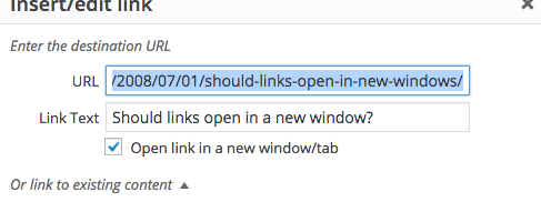
- Warn the user before links open in another tab or window. This is a new concept I’m still struggling with. Should links open in a new window? Basically the argument is that surprising users is bad UI. Taking away a user’s control is bad UI. For accessibility, if a new tab or window opens, and the person can’t physically see that it’s happened, they don’t know it’s happened. More bad UI. So links should never open in a new window or tab except for special cases.However, I’ve also been told that this is an “old mindset” we shouldn’t have to worry about with our tech savvy users, and am still asked many times to just new open tabs/windows. Caught in the middle here, I’ve yet to successfully convince said people otherwise, but I digress. Turns out you can use the screen-reader-text class in links to warn screen-readers if a new tab or window will be opened. Sighted users will still get the “surprise” but at least screen-reader users won’t be – it’s a compromise. Graham Armfield educated me on how to pull this off on a LinkedIn group. Here’s what it looks like:
<a href="www.google.com" target="_blank">Google's site <span class="screen-reader-text">opens in a new window or tab</span></a>
And we’re finally at the end. Together with writing links in context, focus styles, screen reader classes and skip links, I think that covers the most required concepts for accessible links. The only thing that stumps me though, is assuming new windows/tabs are bad, and we agree to implement not doing that, how would we prevent that in the WordPress text-editor. Like this post, I’ve inserted the links using the TinyMCE buttons where it specifically asks if it opens in a new tab or window.
Once I check “open link in a new window/tab”, is there some background function that will insert the screen reader text that warns screen readers of it? Just some food for thought. Probably requires some experimentation on my end.
Anyway, I hope this helped! If it didn’t – or did, please let me know in the comments. If this was awesome, I’d love it if you subscribed in the top right sidebar. Your inbox will only be updated whenever there’s a new post of WordPress goodness. 🙂
Be First to Comment