
[series] View all posts in the Making your WordPress Theme Accessible Series so far… [/series]
Before I get started, I’d like to give a disclaimer that on paper, I am not defined as a “designer” anywhere. I got off that train after a 2-year-no-longer-existing college that’s still drowning me in debt made me seek a better education at the college I eventually got my BA from. I’d also like to confess that I took advanced color theory because credits allowed me to skip the two introductory courses – and that was the biggest mistake I’d ever made. Color is hard and Pratt didn’t play around. Therefore, color, is not my forte.
However, I’m getting better at it! Let’s improve together, shall we?
So, in this fourth installment of my accessibility series, I’d like to review choosing colors for your WordPress site. First, we’ll talk about why choosing the right colors for web accessibility is important. Then there will be a brief overview on color theory with some links pointing you toward those “designers” on paper that could provide deeper insights than I can. Finally, we’ll jump into our WordPress stylesheets and change some key selectors that should make a difference right away in improving our theme’s accessibility. Let’s get started!
First, why does color need to be accessible?
So far in my limited experience in the web development world, I think the assumption is that we create websites for those who can literally see. I don’t think I’ve ever heard anyone suggest that we should consider what “seeing” actually means. It appears as if the issue is treated black and white: either the person can “see” the website or they’re blind and using a screen-reader instead.

However, web accessibility is not just for the blind, but for anyone with low vision that cannot be corrected with glasses. Some examples of these conditions from WebAIM are:
- Macular Degeneration – Blur and vision loss that happens at the center of whatever a person’s looking directly at.
- Glaucoma – This has been described as seeing as if through a straw with blur and no peripheral vision.
- Diabetic Retinopathy – Dark patches in vision, making the spots where the patches are difficult to read.
- Cataracts – A general blurred or hazy effect in vision especially in bright light.
- Color Blindness – There are different kinds of color blindness, but to sum it up, it’s a difficulty distinguishing between certain colors.
Now how big of a problem is this? Let’s just tackle diabetic retinopathy since diabetes is something I imagine most people have heard of by now.
Prevalence: In 2012, 29.1 million Americans, or 9.3% of the population, had diabetes. In 2010 the figures were 25.8 million and 8.3%. (diabetes.org)
So millions of Americans have diabetes and that number is only getting higher. Out of those millions, how many could have their vision compromised due to this disease?
I chose to point diabetic retinopathy out because I think there’s a common misconception that web accessibility means catering to those with “rare” disabilities that “no one actually knows”, and yet, just this one vision condition stems from diabetes alone. This should feel a lot more personal to web developers, so I hope it’s starting to hit home. In my case, diabetes runs in my family and I have family members who love to be on Facebook and shop online just like you and I do. These are real people – standing next to you on the train, chatting with you over coffee, sitting across from you at the conference table.
Now, diabetic retinopathy aside, think of all the other conditions I’ve listed. The number of people with vision disabilities are starting to feel overwhelming now, isn’t it? So by pushing accessibility aside as more of an extra feature than a requirement, how do you think that impacts a site’s business and success?
Anyway, now that we’ve went over that quickly ( with a little guilt-tripping ), if you want more information on how to re-create what it’s like to have one of these low vision problems, Smashing Magazine has the most in depth and excellent reference I’ve seen so far. The article goes over designing with vision accessibility in mind and offers tools/tips to help. I’d definitely recommend taking the time to read it.
All right, we get it! We need to choose accessible colors then!
And this is where it gets hard. Choosing said colors. We can go two routes here. The first route is to learn color theory before choosing a color palette. Here is a list of “on paper” experts I promised to provide that will guide you on your color adventures better than I can:
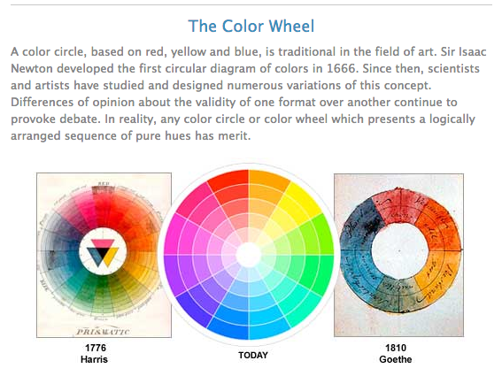
Color Theory Articles & How To’s:
- Color Matters: Basic Color Theory
- Smashing Magazine: Color Theory for Designers, Part I
- TutsPlus: An Intro to Color Theory for Web Designers
- TutsPlus: 6 Beginner Safety Fist Color Guidelines for the Web
- TutsPlus: Defining and Recognizing Colors
- DTelepathy: Using Color Theory to Create a Better Color Palette
Now the second route is to skip learning color theory, and just create a color palette with colors you like. That’s how I started with this blog. If you need help choosing colors, here are some tools to help:
Color Picking Tools:
- 0to255.com
- Lavish Bootstrap
- Color Calculator
- Adobe Kuler
- Colour Lovers
- 28 more tools from CreativeBloq…
Since I’m no master at color theory, based on the education I had and articles I’ve read, here are some rules I set for myself:
- Limit the number of colors
- Try to steer clear of colors that are too close together
- Dark colors on white will work. Light colors on a dark, however, tread carefully.
Great, so I had chosen my colors. Have you chosen yours? Now let’s see if they pass the levels of conformance tests.
Levels of whaaaat? Let’s go over that next.
Can ya read it without squinting or wearing sunglasses?
Basically once you have the colors you want to choose, you need to run them through contrast tools to see if they pass the levels of conformance. The levels of conformance are the WCAG 2.0 requirements your site should live up to. In layman’s terms, what this test does is score how legible and accessible your site is, and also what font size will work best with your colors.
You can test your colors with one of these awesome tools:
There are more tools out there on the web, but I really like how straightforward these two are. For a more in depth review, check out W3.org’s page on conformance levels. For my example, let’s test my theme’s original background color as well as the main font color in Tanaguru Contrast Finder. Then you’ll get an idea of why I had to adjust it afterwards.
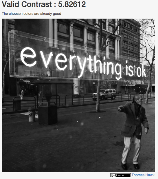
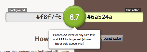
Here are Hexa‘s original background and main font color being tested in Tanaguru. According to this test, it passed!
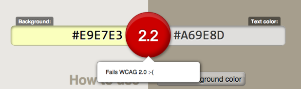
That was awesome – except one itty bitty problem. There were other font colors on the page. So I tested this gold color #a69e8d that was on the site description as well as the post meta like my tags and comment count. Unlike the main font color, that didn’t pass. I then tried it on the Contrast Ratio tool just to confirm – and sure enough, that failed too.
And that’s where I had to use Tanaguru for color suggestions as well as 0to255.com until all my results in the Contrast Ratio tool were all green. Here’s what it looks like when it passes in the Color Ratio tool. It will tell you what conformance level it passes. This is my current background color and the main font color after I adjusted Hexa’s original colors.
And that’s how you choose and adjust colors for accessibility. Once you have these colors though, where should you apply them? Where do we start?
To the stylesheet, Robin!
The easiest place to start for me was the background color and the main font color of the site. Depending on your theme, your stylesheet may differ from mine. My examples below will be based on the Hexa theme just to give you an idea of what you’re aiming for.
So my first goal was to adjust the background-color which was found on line 600:
body {
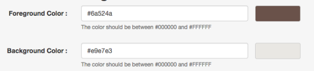
background: #f8f7f6; //was #e9e7e3
color: #6a524a;
font-family: "Source Sans Pro", Helvetica, Arial, sans-serif;
font-size: 18px;
line-height: 28px;
}
Since my main font color passed when paired with my background color in the contrast tools, I just went through the site’s selectors to confirm the color was applied everywhere I wanted. I adjusted the color on the body selector shown above.
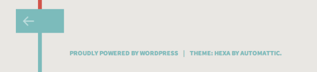
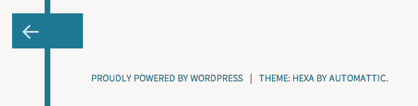
There was also this nice blue-green color, #7cbbbb, on the site as shown below, but it was just too light in some areas and didn’t fair well in the contrast tests. So I went ahead and changed that color globally to #1e7893 with a find/replace in Sublime Text. If you’re not using Sublime as your code editor, whatever you’re using likely has a similar feature to achieve this quickly.
Lastly, I wanted to make all links universally one color, including the post meta which was, by default, a gold color (#a69e8d) that wasn’t very legible either. So I found the selectors and made them all the reddish color (#d25349) you see on the site now.
a {
color: #d25349; //default link colors
text-decoration: none;
-webkit-transition: all 0.3s ease-in-out;
-moz-transition: all 0.3s ease-in-out;
-o-transition: all 0.3s ease-in-out;
transition: all 0.3s ease-in-out;
}

a:visited {
color: #d25349; //visited links will match the default link color
}

.entry-meta, .entry-meta a, .pingback .edit-link, .trackback .edit-link, #cancel-comment-reply-link, .reply {
color: #d25349; //was #a69e8d and is now red too!
font-size: 0.77778em;
line-height: 2.05714em;
}


Practice makes perfect!
And there you have it! I made my colors accessible by adjusting them in the contrast tools until they passed the levels of conformance. It really took some experimentation, but it was worth it. And all I did was focus on the background color, the main font color and the link colors.
This may differ depending on your theme, but I hope I’ve given you a good starting point to give it a try. Colors seem like a small change to make when compared to all the other things we can do to increase our theme’s accessibility – like images and headings – but we’re now one step closer to having an accessible WordPress theme.
Questions? Comments? How did your colors fair in the contrast tool tests? I’d love to hear about it. Drop me a comment below. Until next time!
Excellent article, and very fun! I hope it is getting a lot of views because it deserves it!
As I read it, I thought of three things that could make it even better (and I hope you’ll consider adding them):
First is a link to either Paciello or Vision Australia’s color contrast analyzer. Their analyzers are downloadable (and work with any program/browser) and have an eyedropper feature that I really love.
–Vision Australia: http://www.visionaustralia.org/business-and-professionals/digital-accessibility-services/resources/downloads
–Paciello: https://www.paciellogroup.com/resources/contrastanalyser/
Second, you may want to add something about using link colors that have enough contrast with surrounding text. http://www.w3.org/TR/2008/NOTE-WCAG20-TECHS-20081211/working-examples/G183/link-contrast.html
Even though these guidelines are for links, I try to apply them to all colored, stand-out text (especially if the links are underlined).
Finally, you may want to emphasize that you shouldn’t use color alone to designate important or stand-out information since “the text in red” doesn’t look red to all people.
Anyways, as I said, great article!
Hi Michelle,
Whoa, thanks for all the new a11y resources! Definitely appreciated! You also make a good point about color not being the sole focus when it comes to accessibility. I also hadn’t thought of keeping the surrounding text in mind when choosing link colors! Looks like I learned something new haha – thanks again!
I’m gathering another list of resources for a11y so perhaps when I write my second post of them, I can include these as well.
Thanks for reading. 🙂