
I recently faced planning a site that was extremely image heavy. I mean big beautiful heroes and HD videos everywhere – the works! It was like going to an IMAX movie except in website form! Anyway, the point is, there was a lot going on and it was very important that the site remained just as beautiful when the screen shrinks down to mobile as this was a responsive site. The thing is – the images were huge! Trying waiting for a 1400px image to load on a your 5+ year old LG Android – you’re gonna be there a while.
So the problem was, how do I properly code responsive images in WordPress without one, torturing users with slower internet connections and two, still maintaining good practices?
I was set on finding a solution. So I did what most developers do. I consulted other devs and the great all-knowing “Google.” Here were the results of my search:
- “Meh. Just use width: 100%; in CSS and let the browser do it.” ( Terrible idea. Please don’t thoughtlessly take advantage of this. )
- Hassle Free Responsive Images for WordPress by Chris Coyier. ( A much better solution. )
- Responsive Images in Practice by ALA. ( Browser support for Picture/srcset are not very good. )
- Srcset and Sizes by Eric Portis. ( Same as above ALA article. )
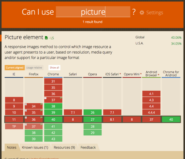
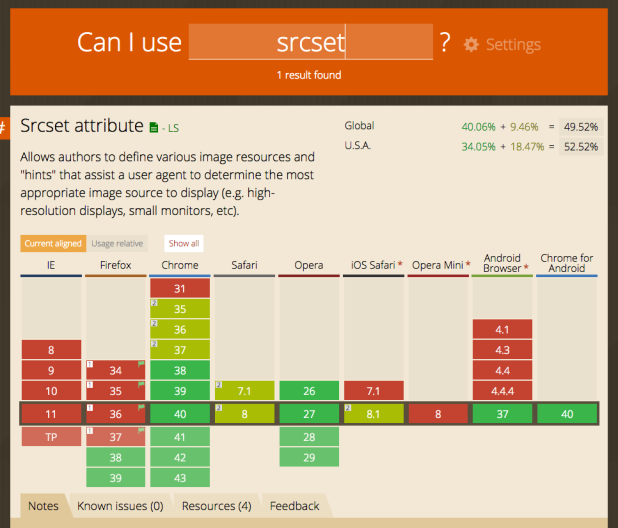
None of the solutions I found had guaranteed support in modern browsers ( see screenshots above ) and the best idea seemed to be Chris Coyier’s solution that uses the PictureFill library. I was about to use PictureFill when I realized there was another factor I had to consider. I was already using the Foundation 5 framework integrated into my WordPress install. Did I really need to add yet another plugin to this? And that’s when it struck me…
Reading Chris’ WordPress solution and Eric’s charming article (OMG the peas!), I liked the idea of swapping out image sources depending on the viewport. Eric goes over some issues of trying to write this manually, mainly breaking your head with media queries and superficial mathematical equations that aren’t dynamic enough for the site if something changes. Oh and yucky markup. Chris Coyier uses WordPress’ add_image_size function and several PHP functions to extend PictureFill.

With this in mind, it turns out Foundation has a Javascript component called Interchange. What Interchange does is swap out urls depending on Foundation’s built in breakpoints (media queries). What this meant for me was:
- I don’t have to break my head with complex math or extra media queries. ( Good because I hate math! )
- I don’t have to use PictureFill as this does the same thing except already integrated into my project.
- I don’t have to worry about browser support for the picture element or srcset.
- Lastly, I can write less PHP as I’m only using one function from WordPress to get started.
All wins! Of course, I only recommend this if you’re already using Foundation. If not, I vote PictureFill as the best way to go.
First, create your custom image sizes.
Now that I went through my long, boring rant of how I came upon this, I want to share how I implemented this solution. I wouldn’t recommend going crazy with it as it’s still Javascript so spamming the technique multiple times on every page probably isn’t going to help performance either, but I think if there are only a handful of large images per page, this works nicely.
My first stop was to my theme’s functions.php file where I dropped this baby in:
<?php
/**
 * Create Custom Image Sizes for Responsive
 * Based on Foundations breakpoints for SM, MD, LG
 */
function namespace_add_image_sizes(){
  /* Soft proportional crops */
  add_image_size( 'large-hero', 1400 );
  add_image_size( 'medium-hero', 1024 );
  add_image_size( 'mobile-hero', 640 );
}
add_action( 'init', 'namespace_add_image_sizes');
Basically what this function does is create three new images sizes based on the maximum size of Foundation’s default breaking points. I confess that I didn’t use ems because I’m not cool and am more familiar with pixels than I am with other units. But PHP makes me feel cool? Does that count? No? Okay, moving on.
The add_image_size function takes advantage of WordPress’ out of the box functionality where every time a user uploads an image, it saves into the media library, and then copies those images in specific sizes within the “wp-content > uploads” folder of the WordPress site. This is where WordPress uses the default 3 image size settings you’ll see if you go to “Settings > Media” on your dashboard. You’ll usually see thumbnail, medium and large. So instead of relying on WordPress’ built in sizes, we’re creating our own. This is a great way to go about this because you don’t have to depend on your client to upload images of several different sizes. Instead, they can upload the maximum size of their image, and WordPress will take care of the rest with our customizations.

Next, assign variables to your custom image sizes.
Then I went into my theme files, wherever images were being pulled, and threw one of these in. Depending on whether I was swapping out an image source, a background image, or a featured image, the code is slightly different. I’ll explain case by case. But first, let’s go over what we’d need in general no matter the case.
At the top of a template file that I’m working in, I dropped this in. Notice how ‘large-hero’, ‘medium-hero’, and ‘mobile-hero’ all refer to the sizes I created in my functions.php. All I did here was assign the sizes to variables to make code cleaner as we go on.
<?php
/* Custom sizes created in functions.php */
$img_size_lg = 'large-hero';
$img_size_md = 'medium-hero';
$img_size_sm = 'mobile-hero';
Then, retrieve the image in those sizes.
Depending on where your image is coming from, this may look a bit different.
*Special Note: If you’re using ACF, make sure your image field is returning the object for this to work in the templates. Thanks, Mark!

Advanced Custom Field:
<?php

/* Get image sub-field in ACF */
$hero_image = get_sub_field('acf_hero_image');

/* Get custom sizes of our image sub_field */
$hero_lg = $hero_image['sizes'][ $img_size_lg ];
$hero_md = $hero_image['sizes'][ $img_size_md ];
$hero_sm = $hero_image['sizes'][ $img_size_sm ];
I’m using get_sub_field from ACF to grab the image field object. Then I’m taking that object, and grabbing the urls for each specific size. These urls are assigned variables for our upcoming step.
Featured Image/ The Post Thumbnail:
<?php

/* Get Featured Image/Post Thumbnail ID */
$feat_img_id = get_post_thumbnail_id();

/* Use ID to get the attachment object */
$lg_hero_array = wp_get_attachment_image_src( $feat_img_id, 'large-hero', true ); //Large Hero
$md_hero_array = wp_get_attachment_image_src( $feat_img_id, 'medium-hero', true ); // Medium Hero
$sm_hero_array = wp_get_attachment_image_src( $feat_img_id, 'mobile-hero', true ); // Mobile Hero

/* Grab the url from the attachment object */
$hero_lg = $lg_hero_array[0]; //Large Hero
$hero_md = $md_hero_array[0]; // Medium Hero
$hero_sm = $sm_hero_array[0]; // Mobile Hero
This is the same solution on Chris Coyier’s, “Get Featured Image Url“. I’m grabbing the ID of the post thumbnail. Then I’m using that ID in wp_get_attachment_image_src to get the 3 objects, one for each custom size. Then I filter it down to retrieve the urls for each size, and assign them to variables for our upcoming step.
Then, hook up Interchange.
Image Source:
<!-- Hook up Interchange as an img src -->
<img class="my-hero superman" data-interchange="[<?php echo $hero_lg; ?>, (default)], [<?php echo $hero_sm; ?>, (small)], [<?php echo $hero_md; ?>, (medium)], [<?php echo $hero_lg; ?>, (large)]" />
<noscript><img src="<?php echo $hero_lg; ?>" /></noscript>
Background Image:
<!-- Hook up Interchange as a background image -->
<div class="my-hero batman" data-interchange="[<?php echo $hero_lg; ?>, (default)], [<?php echo $hero_sm; ?>, (small)], [<?php echo $hero_md; ?>, (medium)], [<?php echo $hero_lg; ?>, (large)]">Content Goes Here!</div>
For both examples, I’m using the variables that I set aside earlier with the urls, whether the images are pulling from ACF or a post thumbnail, and then dropping them within “data-interchange”. There is a default set, then the urls for large, medium, and small set. Then a no script fallback for browsers with Javascript disabled.
Finally, here’s what it looks like all together.
I broke the examples up into pieces to hopefully make it easier to understand how it all comes together. Now this is what it all looks like in one chunk within a template file.
Advanced Custom Field Solution:
<?php
/* Custom sizes created in functions.php */
$img_size_lg = 'large-hero';
$img_size_md = 'medium-hero';
$img_size_sm = 'mobile-hero';


/* Get image sub-field in ACF */
$hero_image = get_sub_field('acf_hero_image');
$hero_image_alt = $hero_image['alt']; /* Get image object alt */

/* Get custom sizes of our image sub_field */
$hero_lg = $hero_image['sizes'][ $img_size_lg ];
$hero_md = $hero_image['sizes'][ $img_size_md ];
$hero_sm = $hero_image['sizes'][ $img_size_sm ];

?>

<!-- Hook up Interchange as a background image -->
<div class="my-hero batman" data-interchange="[<?php echo $hero_lg; ?>, (default)], [<?php echo $hero_sm; ?>, (small)], [<?php echo $hero_md; ?>, (medium)], [<?php echo $hero_lg; ?>, (large)]">Content Goes Here!</div>

<!-- Hook up Interchange as an img src -->
<img class="my-hero superman" data-interchange="[<?php echo $hero_lg; ?>, (default)], [<?php echo $hero_sm; ?>, (small)], [<?php echo $hero_md; ?>, (medium)], [<?php echo $hero_lg; ?>, (large)]" alt="<?php echo $hero_image_alt; ?>" />
<noscript><img src="<?php echo $hero_lg; ?>" alt="<?php echo $hero_image_alt; ?>" /></noscript>
Featured Image/ The Post Thumbnail Solution:
<?php
/* Custom sizes created in functions.php */
$img_size_lg = 'large-hero';
$img_size_md = 'medium-hero';
$img_size_sm = 'mobile-hero';

/* Get Featured Image/Post Thumbnail ID */
$feat_img_id = get_post_thumbnail_id();
$hero_img_alt = get_post_meta( $feat_img_id , '_wp_attachment_image_alt', true ); //get alt attribute

/* Use ID to get the attachment object */
$lg_hero_array = wp_get_attachment_image_src( $feat_img_id, 'large-hero', true ); //Large Hero
$md_hero_array = wp_get_attachment_image_src( $feat_img_id, 'medium-hero', true ); // Medium Hero
$sm_hero_array = wp_get_attachment_image_src( $feat_img_id, 'mobile-hero', true ); // Mobile Hero

/* Grab the url from the attachment object */
$hero_lg = $lg_hero_array[0]; //Large Hero
$hero_md = $md_hero_array[0]; // Medium Hero
$hero_sm = $sm_hero_array[0]; // Mobile Hero

?>

<!-- Hook up Interchange as a background image -->
<div class="my-hero batman" data-interchange="[<?php echo $hero_lg; ?>, (default)], [<?php echo $hero_sm; ?>, (small)], [<?php echo $hero_md; ?>, (medium)], [<?php echo $hero_lg; ?>, (large)]">Content Goes Here!</div>

<!-- Hook up Interchange as an img src -->
<img class="my-hero superman" data-interchange="[<?php echo $hero_lg; ?>, (default)], [<?php echo $hero_sm; ?>, (small)], [<?php echo $hero_md; ?>, (medium)], [<?php echo $hero_lg; ?>, (large)]" alt="<?php echo $hero_image_alt; ?>" />
<noscript><img src="<?php echo $hero_lg; ?>" alt="<?php echo $hero_image_alt; ?>" /></noscript>
I’ve also grabbed the alt attribute in both of the examples above, assuming the user fills it out in WordPress. If you’re not sure why this is necessary, check out an earlier post of mine, “How to Make Your Images Accessible.”
Closing thoughts and CSS.
And that’s the entire solution. So far, it’s working out for me and is something I plan to continue using in my WordPress/Foundation projects unless either, one, the site needs IE support (ick) or two, srcset and picture gain better browser support. Right now with these examples, the images just swap out between the three custom sizes that were set in functions.php. For them to re-size to their containers, that will take a little CSS. Most likely the “Meh, use width 100%” line I was poking fun of earlier. It’s fine to let the browser re-size an image slightly versus re-size a giant 1400px image down to a 320px screen. It’s also fine so long as you’re not letting the browser do the bulk of the image work. Just read an article recently that was some good food for thought, “Battle of the Image Compression WordPress Plugins.” Definitely take a look – it’s a good read.
I’m interested if anyone else has had any success implementing this solution or maybe alternative ones in WordPress using Foundation. As I’m fairly new to the framework still, I’d love to swap tricks. Criticisms? Praise? Be sure to let me know in the comments.
Also if you really liked this tutorial, I’d love it if you subscribed! More WordPress goodness will be in your inbox. Just click the ole’ “Subscribe” button on the top right sidebar.
Thanks for reading. 🙂
Really interesting approach. I keep meaning to dig into Foundation more. I’ve just been building with Roots and Underscores for quite a while I don’t take the time to venture out. Definitely a big need for the picture element to get more browser support, that really should be the go-to solution in the near future, silly to have to rely on JS for this sort of thing.
Also thanks for the shout out to my Image Compression article. Seems like you have some great media related content here too. Subscribing now and looking forward to more great articles from you. Thanks!
Hi Matt,
I’m really loving Foundation so far, but ooh – Sage and Bedrock? Looks like you’ve introduced me to some new things as well. Will definitely give those a try. 🙂
I agree that we shouldn’t have to rely on JS to get the most out of responsive images – I really loved the idea of srcset and the picture element just swapping out image sources, but the browser support killed my chances at using it. I can’t wait until it becomes a standard across the modern browsers, it will definitely help out.
And np! As someone who’s used Eww and heard of Kraken, your article really helped me figure out the difference between the plugins. There are so many plugins that seem just as popular and do almost the same thing – it’s hard to choose sometimes so your article helped out.
Thanks for reading! I appreciate the subscribe. I subscribed on your blog as well. Looking forward to swapping WordPressy code magic. Take care.
Rachel
Great post! You can use this same technique via a filter to automatically add this to any images pulled in via wp_get_attachment_image():
add_filter(‘wp_get_attachment_image_attributes’, ‘interchange_the_images’, 10, 2);
function interchange_the_images ( $attr, $attachment )
{
/* Use ID to get the attachment object */
$lg_hero_array = wp_get_attachment_image_src( $attachment->ID, ‘large’, true ); //Large Hero
$md_hero_array = wp_get_attachment_image_src( $attachment->ID, ‘medium’, true ); // Medium Hero
$sm_hero_array = wp_get_attachment_image_src( $attachment->ID, ‘thumbnail’, true ); // Mobile Hero
/* Grab the url from the attachment object */
$hero_lg = $lg_hero_array[0]; //Large Hero
$hero_md = $md_hero_array[0]; // Medium Hero
$hero_sm = $sm_hero_array[0]; // Mobile Hero
$attr[‘interchange’] = ‘[‘ . $hero_lg . ‘, (default)],[‘ . $hero_sm . ‘, (small)],[‘ . $hero_md . ‘, (medium)],[‘ . $hero_lg . ‘, (large)]’;
return $attr;
}
Gist version: https://gist.github.com/hereswhatidid/078b8641acf84a37c0df
The ACF Image example only works with Image Object return value selected. If that is obvious then sorry but it wasn’t for me. (error: size otherwise)
Hi Mark,
Sorry about that! You’re right, I probably should mention that just in case. I always have the image settings in ACF return the object as a habit so I guess it just slipped my mind. Thanks for that. Will edit now. 🙂
Rachel
The best blog I ever read…cool man!
No edit option unfortunately… 🙂 cool lady!
Thanks, Moses. Happy that it’s helpful. 🙂
I really want this! I’m at a loss as to why this looks like its working in inspect editor as the urls are populating as expected but I do not see an image. My initial thought was foundation.interchange.js wasn’t referenced but adding it made zero change.
Hi Heather,
I’m sorry to hear it’s not working. This tutorial is a few years old already, so it’s possible that Foundation’s code has changed or there is a better approach now than what I wrote about here.
The way I like to troubleshoot is to simplify the problem. Looks like my tutorial gets a lot of things from a lot of functions. I would comment it all out, start from the beginning, and variable by variable/function by function, var_dump the values to see if something is failing somewhere. Also, if you see something being returned when you var_dump, but it’s not displaying, try using PHP’s “echo” to visually show the value.
Hope that helps a bit. Good luck and thanks for reading. 🙂